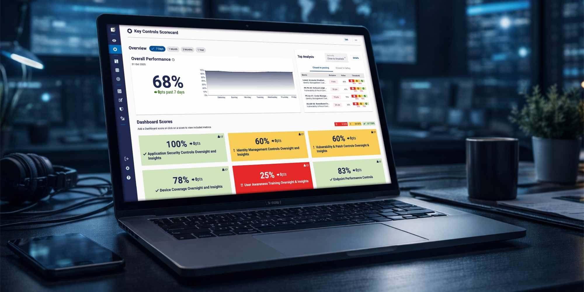
Users needed a quick way to understand if their data was flowing correctly, without manually checking tables.
I was the sole designer on this feature, responsible for translating product requirements into a clear and usable experience.
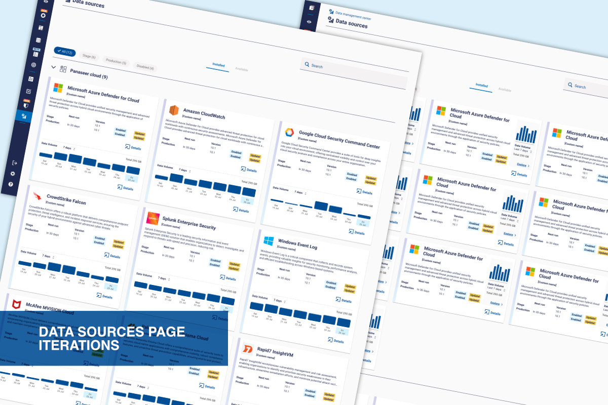
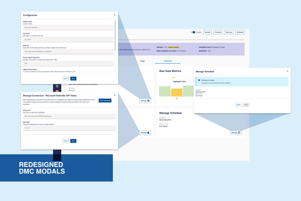
My work included designing the data visualisation, restructuring parts of the Data Management Console (DMC), and defining interactions.
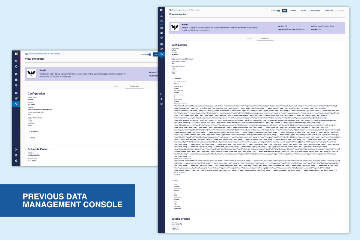
Previously, users had to review tables of numbers to spot data drops or anomalies. This was slow, error-prone, and difficult to scale across multiple connectors.
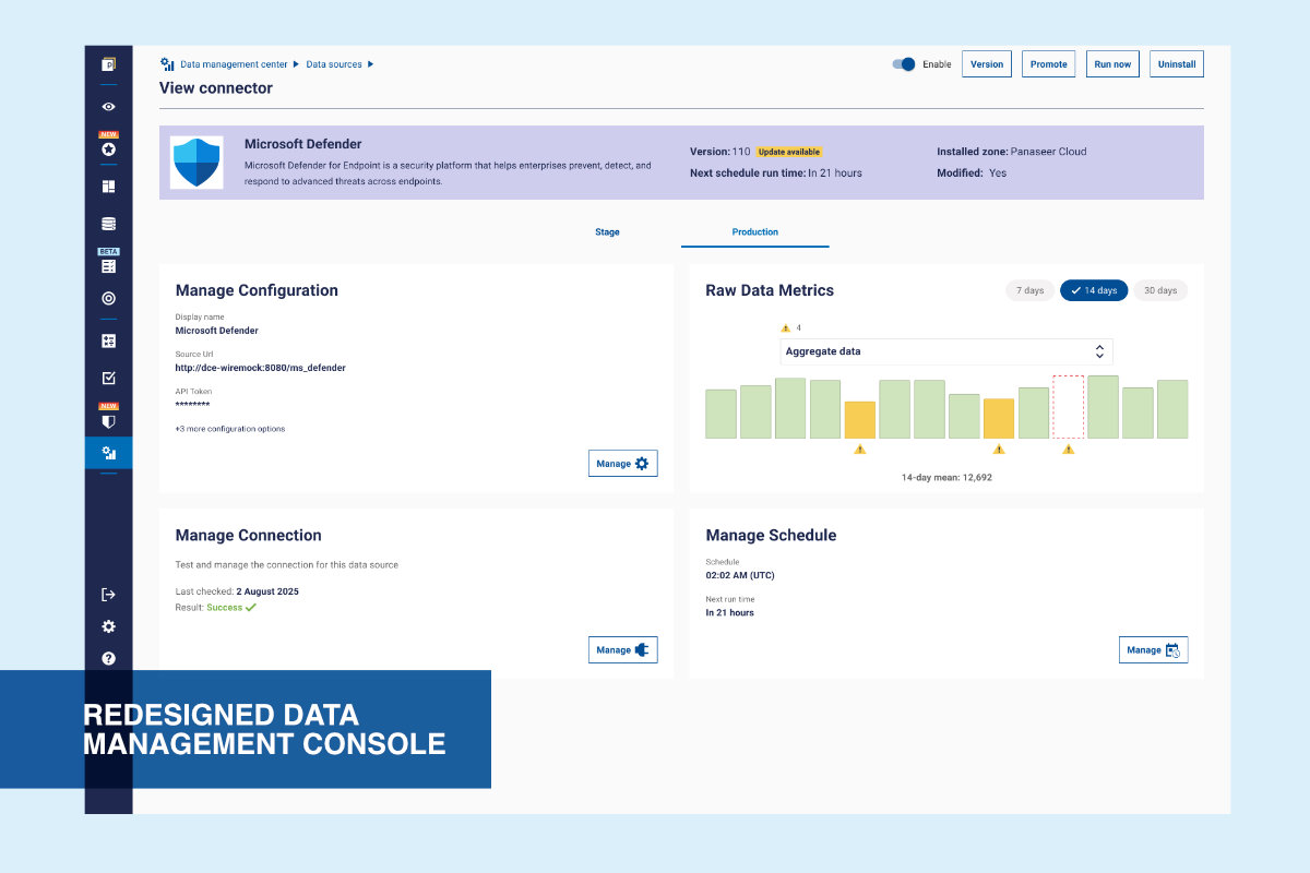
Introduced a visual layer that allows users to monitor data ingestion at a glance and investigate issues when needed.
The visualisation is used in two contexts:
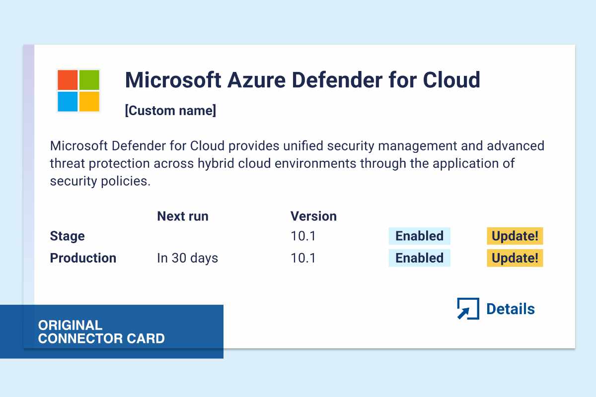
• Connector cards → quick scanning across multiple connectors
• Detail view → deeper analysis of a single connector
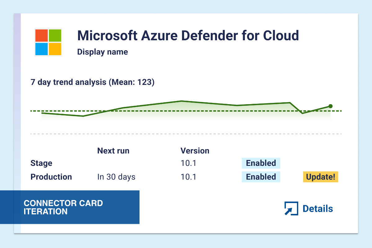
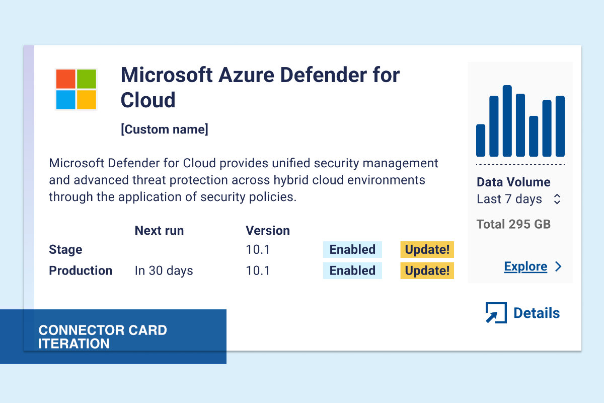
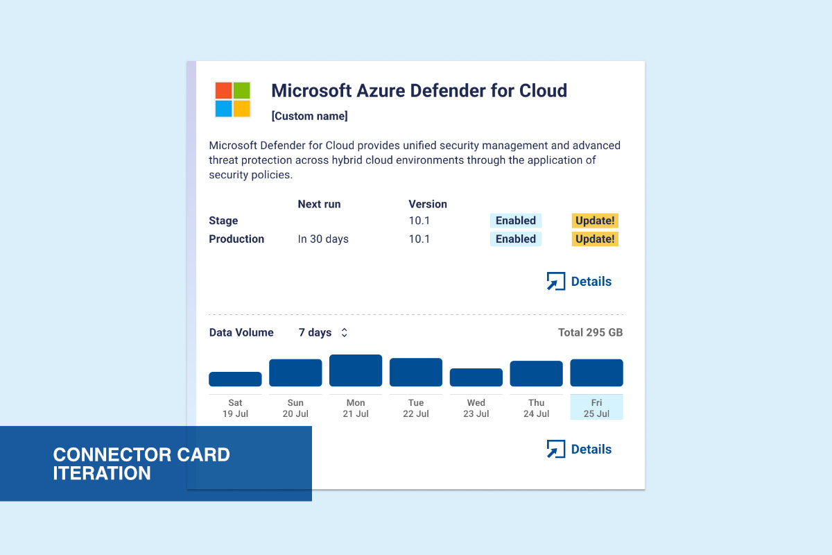
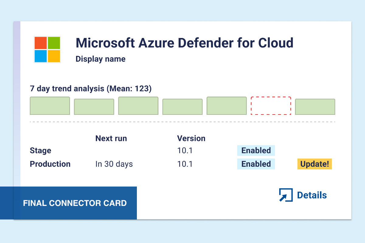
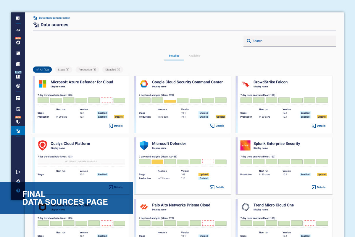
• Bar chart for clear comparison of daily values
• Default 7-day view for quick scanning
• Flexible time range in detail view only
• Warning indicators to highlight anomalies
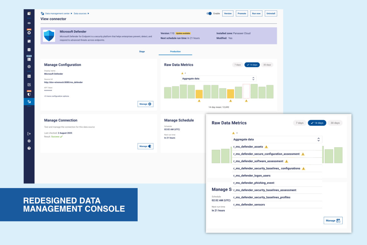
Defined interactions such as hover states, empty states, and anomaly indicators, iterating with engineering to ensure clarity and performance. Beta varsion released to select clients to gather initial feedback.
Replaced a manual, table-based process with a clear visual overview. Users can now quickly identify anomalies and investigate issues without relying on support.
©Michele Tagliavini 2026