SEO agency’s analysis highlighted improvements needed, relating to copy, keywords and content in general.
The pages looked too dry and did not show the same level of care as the print brochures.
Company’s expertise on the subject was not leveraged properly.
Interactive map (Stackla) showed little or no engagement.
I designed a new template, highlighting different sections and dividing into tabs.
I organised information according to SEO best practice and in line with company’s strongpoints.
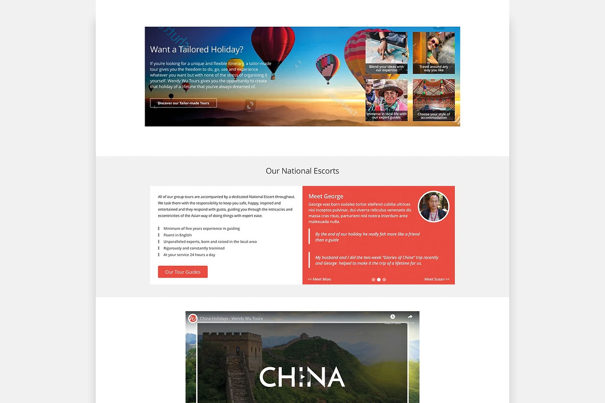
I created new features which have also been rolled out to other parts of the website (right-column CTA and advice box, Tour cards carousel, Tailor-made widget, and blog feed).
New tab sections present information in a clearer and useful way, by means of filters and categories.
I achieved consistency of content between the printed brochures and destination pages.
I worked also on new search/filtering functionality and new weather display but those have not been implemented yet. The new template was rolled out during the pandemic, when traffic and usage had dropped so dramatically that testing was inconclusive.
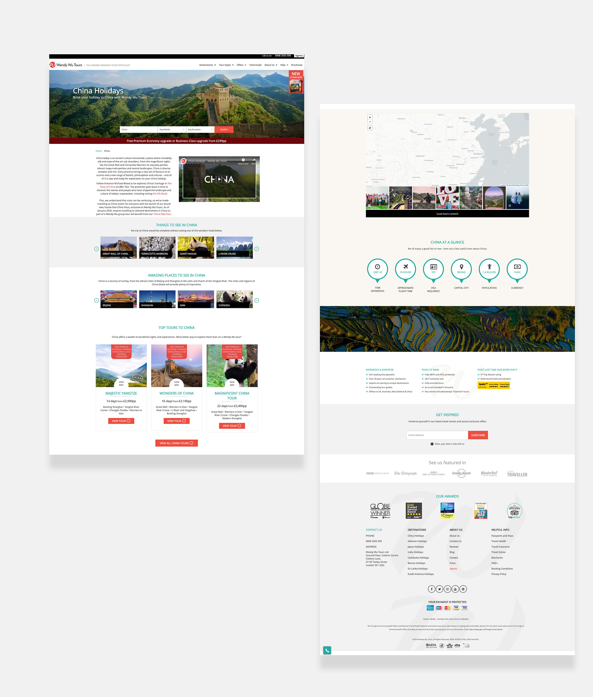


As with many things on the website, the style was inconsistent. The mobile version (as many sections of the website) was clunky and lacked refinement.
We also wanted to test the layout of different elements to improve access to the booking engine.
Pricing grid is very bland, no real hierarchy of information, very traditional and bland table.
I have redesigned the page changed the layout of the first information pieces, including the site-wide right column CTA box.
I have updated the style of all images to achieve consistency across the website.
I have devised a new tour map and a whole new way to display prices. These features required more development work and would be implemented in a second phase.
Despite internal approval, only some of my suggestions were implemented due to the international situation, shifting priorities and lack of time and resources.
Regretfully it’s a bit of a “half-way house”, where only some of the new elements were introducted and nothing could be done for the new map and pricing grid, although this was moved up the page after testing showed a greater user engagement and lower bounce rate.


©Michele Tagliavini 2026